Layout Editor

Contents
The Layout Editor allows the user to define how the properties of a Biskit will be displayed. This is required because Biskits could have a large number of properties, numbering in the hundreds, and in order for users to find those properties to update them, it is necessary to organise them.
The Layout Editor allows the user to organise the properties of a Biskit into multiple Property Groups, Property Groups may themselves contain child Property Groups.
Property Groups at the same level may be organised in one of five ways, Vertical Tabs, Vertical Tabs (Sorted by Name), Horizontal Tabs, Captions and Flow. Property Groups may have a heading and may also be hidden.
The properties contained within a Property Group may also be organised in one of four ways, Simple Table, Multi Column Table, Radio Button Table and Custom HTML.
For each table, row, column or cell the standard CSS can be changed allowing the user to set such things as font, background colour, border size, type and colour and many other attributes.
Finally for any Property Group, Notes can be set up to be created and then displayed in a Notes Waterfall.
The Layout Editor is split into four sections in two panes.
1.The left hand pane shows a list of BiskitDefs that have had layouts created for them, when a BiskitDef is expanded all the layouts defined for that Biskit will be shown. Any in red are currently not enabled.
2.The right pane is split into three areas:
a.Top is the layout menu and the header information for the current layout. (Top Pane)
b.Bottom left shows the organisation of the Property Groups and properties for this layout in the form of a tree. (Organisation Pane)
c.Bottom right displays information depending on what is selected in the organisation tree in the bottom left pane. (Information Pane)
i.If a Property Group is selected then the header information for that Property Group is viewed along with any properties assigned to that Property Group.
ii.If a Properties branch is selected then the properties are shown in a list
iii.If a single property is selected then information about that property will be shown.

Left Pane
The Left Pane shows the Layout Tree (see image above). Showing for each BiskitDef the layouts that are available. It also has a tool bar which allows the user to open and close all the branches to the tree.
For a complete description of the standard toolbar buttons read the Toolbar Button Standard Definition chapter.
Top Pane With Layout Toolbar
The Top Pane shows the header information for a layout. To create a new layout press the Create button and then choose the BiskitDef the layout is for.
Property |
Description |
|---|---|
Displayed Type |
The BiskitDef the layout is for. |
Enabled |
Whether this layout is currently to be used. Disabled layouts are shown in the layout tree in the left pane in red. |
Unassigned Properties Display Location |
Specifies how all unassigned properties will be displayed. Either Show in Main Table where the properties are shown in a table above the tabs section or Shown in Property Group where the properties are shown as the first tab in the tabs section with a name for the tab assigned by the user. |
Version |
Current version number of the layout. |
Created |
When the layout was created. |
Updated |
Last time the layout was updated. |
The Top Pane also has the Layout toolbar which enables the user to edit, create and delete layouts as well as being able to preview the layout already defined.
For a complete description of the standard toolbar buttons read the Toolbar Button Standard Definition chapter.
Layout Toolbar Item |
Description |
|---|---|
Preview |
This will display a preview of the current layout as defined. When in edit mode this preview will be up to date and you do not need to save first. The preview will display initially in read-write mode, but the user can change the mode using a toggle at the top of the view to see what the display would look like in read-only mode. Some information is only displayed in read-only mode. The information in the properties in the preview is constructed in a random manner to give the user an idea of what the layout would look like with data and is not read from the database. |
By pressing the Preview button a view of the current layout showing the different areas will appear. Use this preview to walk around the layout checking how it works.
The Flow grouping method, means the name of a "tab" is ignored and is intended for when a caption or a box is not required around a set of properties. It provides a cleaner look when there are multiple sections displayed together. This can be combined with multiple columns to allow display of many areas at once.
If either Captions or Flow are chosen then the user also has the choice of whether to display the property groups in one or multiple columns. If multiple columns are chosen the user can define the minimum width and height to display each property group in.
Shown below are the results of displaying in multiple columns.

|
This pane shows how the properties of a Biskit have been organised into Property Groups and child Property Groups as a tree structure.
The layout is defined at the top of the pane, the layout will have a Properties and Unassigned Properties branch.
Property Groups are then created When a Property Group is created it will automatically have a Properties branch which will initially be empty.
Property Groups can be reordered by dragging and dropping the group elsewhere within its parent.
To move a Property Group from its current parent to another parent they can be dragged and dropped or by using cut and paste. Cut the Property Group, select the new parent, paste the Property Group. Then reorder as above.
Hidden Property Groups are displayed in red.
The user in edit mode can move properties from one Properties branch to another by dragging and dropping. All the properties in a Properties branch can be moved by dragging the branch to a different Properties branch. Also properties can be dragged from a property list in the Information Pane and dropped into a Properties branch in the Organisation Pane.
Properties can be reordered within a Property Group by dragging and dropping the properties.
The search box can be used to find a property. Once the user starts typing a name into the search box, a list of possible properties will appear, as the user continues typing the possible list will reduce, until only one remains. The Properties branch containing that property will be expanded in the tree and the property will be highlighted.
If what has been typed does not match any possible property the search box will be outlined in red and the search text will also go red. |

The Information Pane will have information about the item that is currently selected in the Organisation Pane. There are three types of items that can be selected
1.A Property Group.
2.A Properties branch
3.A property
|
If a Property Group is selected then information about that group is displayed. Any properties associated with the Property Group are listed under the Property Table tab showing their Name and Label. The Notes tab allows the user to define whether this Property Group contains a Notes field and/or a . The Copy button allows the user put a copy of this Property Group into the buffer for later pasting. |
|
Description |
||
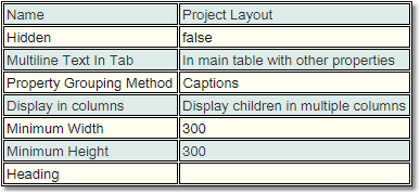
Name |
Name of the Property Group |
|
Hidden |
Whether the Property Group should be hidden from view. |
|
Multiline Text in Tab |
Whether any Multiline text will be displayed in a Separate Tab (original functionality) or In main table with other properties (new functionality). |
|
Property Grouping Method |
How the child Property Groups of this Property Group should be grouped/displayed. Vertical Tabs, Vertical Tabs (Sorted by Name), Horizontal Tabs, Captions and Flow. To see examples of these layout types look at the Preview image above. |
|
Heading |
Any heading to be displayed with this Property Group. These can have HTML style and class attributes defined such as <i> </i>. |
|
Property Table Type |
How Properties belonging to this Property Group will be displayed. Simple Table, Multi Column Table, Radio Button Table and Custom HTML. |
|
|
If a Properties branch to the tree is selected then the properties grouped here will be displayed as a list, showing their Name and Type. |
|
|
If an individual property is selected then the properties Label will be viewed. This is so the user can see what will be written for this property in the layout.
|
|


|
If the property selected is of type Biskit then there will also be an option of how to display the Biskit information. Either as a Show Simple, (as a single element in a table) or Show in Property Group with a name assigned by the user (treating the Biskit as the first Property Group. If the Biskit has a layout defined it will be used, otherwise all the properties will be displayed as a simple table.) |
|
If a property is selected from the unassigned properties branch the information from the Bakery about the property is displayed for information. This information can NOT be edited here even if the layout is in edit mode. To edit the details of a property the user will need to go to the Bakery. |


On entering edit mode what is viewed in the Information Pane will vary depending on what is selected in the Organisation Pane.
If a Property Group is selected then the header information for the Property Group will be shown in an editable form. See the table in the previous section for a description of the information displayed.

There will also be an edit toolbar.
Property Group Toolbar Item |
Description |
|---|---|
Add New |
Adds a new Property Group at the same level as the currently selected Property Group. |
Add New Child |
Adds a new Property Group as a child of the currently selected Property Group. |
Cut |
Cuts the currently selected Property Group, removing it from its current place in the tree and puts it in the edit buffer overwriting any current contents. |
Copy |
Takes a copy of the currently selected Property Group and puts it in the edit buffer overwriting any current contents. |
Paste |
Pastes the current buffer contents as a child of the currently selected Property Group. When pasting a Property Group care needs to be taken if the Property Group has any properties associated with it. Properties can only appear once in a layout and the editor will remove properties that clash with the pasted properties. |
Delete |
Deletes the selected Property Group. Any properties associated with that Property Group will be moved to the Unassigned Properties branch. |
Show Cell CSS Editors |
This will display in each cell of the properties a little icon allowing the user to start up a CSS editor for that cell. For more on the CSS editor read the section on CSS Editors. |
If a Properties branch is selected then a list of properties will be shown in the Information Pane.
There are four ways to move properties within a combination of the Organisation Pane and the Information Pane
1.An individual property can be selected in the Organisation Pane and dragged to a new position in the list.
2.An individual property can be selected in the Organisation Pane and dragged and dropped into a different Properties branch.
3.A Properties branch can be selected in the Organisation Pane and dragged and dropped into a different Properties branch, all the properties in the dragged branch will then transfer to the new branch.
4.In the Information Pane using shift and ctrl, a number of properties can be selected from the viewed list and dragged across to a Properties branch in the Organisation Pane.
In all the above cases dropping the properties on a Property Group name will place the properties in the Properties branch for that Property Group.

There are four different ways to display a list of properties.
1) Simple Table

Information in a Simple Table will be displayed with the property label and the property value.
2) Radio Button Table

Information in a Radio Button Table is displayed showing the property labels and then a choice of values. This type of table is limited to the following
a.All properties must be of the same type.
b.They must be one of the following types:
i.Biskit valued.
ii.Mapped Integer.
iii.Mapped String.
3) Multi-Column Table

Information in a Multi-Column Table will be displayed with the property label and the property value. If multiple columns are being displayed only the labels of the properties required for the number of rows being used will be displayed.
Multi-Column Table |
Description |
|---|---|
Row Labels |
Allows the user to define how row labels are displayed.The choices are 1) Default row labels 2) Custom row labels 3) No row labels. |
Number of Property Columns |
The number of columns used to display the properties. The first property in the list will have its value displayed at the top of the first column, the next property value at the top of the next column and so on until the columns are filled up. The next available property value will then be displayed in the second row of the first column, property values will then fill in the second row before moving onto the next row and so on until all property values have been displayed |
Show Column Headings |
Displays column headings into which the user may place their own labels. |
Column Label Alignment |
Defines whether the column labels are left, centre or right justified. |
Row Label Alignment |
Defines whether the row labels are left, centre or right justified. |
|
Adds a new empty cell after the current cell. Useful for filling out tables which have a variable number of rows. |
4) Custom HTML
Enable building of a table structure using HTML.

Other Display Options
Boolean properties have additional options, click on the property to get

The display type can be either a list box or a check box and the user can define the text to be used for True, False and Null.
Biskit properties have additional options, click on the property to get

The details of the Biskit can be displayed either as a simple table of all the properties (Show Simple) or in a separate Property Group (Show in Property Group) using the current layout type, Horizontal, Vertical or Caption. Also if a layout has been defined for the Biskit then the layout definition will be used for the properties of the Biskit.
Set properties have additional options, click on the property to get
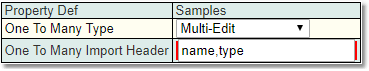
The Set can be edited in the Regular way, one at a time, or Multi-Edit (or Multi-Edit (on click)) can be set up, so multiple children of the can be created and edited together. If the One To Many Import Header is setup with the properties of the Multi Edit then there will be the option to Download and Upload.
The Multi-Edit of sets has a number of options:

Delete - Select a number of rows using the the checked boxes and the minus will remove them all.
Edit - Edits the ticked children in a popup. (Checked editing)
Add - Adds a new row to the bottom.
Add Many - provides a pop-up to decide how many rows need to be added.
Copy - Copy the selected cell(s). Use shift to select multiple cells.
Paste - Paste the copied cells.
Download - Download the table as a CSV file.
Upload- Use a csv file to load information into the table.
The user can add areas to the layout which enable the storing of notes. In order to do this a BiskitDef needs to be created to hold the note information. This BiskitDef must have at least two properties. Optionally the user can also define a property to hold the Category of note to be stored.
Property Type |
Description |
|---|---|
String |
This property will hold the Note information. If the StringPropertyType is HTML then the note will support Rich Text Format. |
Biskit |
This property will define the parent BiskitDef that the Note is for. This property must be an Automated Property Type, set to Create and Update, the Biskit Def must be set to the parent Biskit Type and the Biskit Property Type must be set to To One. |
Biskit |
This property will define the Category BiskitDef that the Note is associated with. If used the Category is stored with the note and is used to determine which Waterfall the note will be displayed in. |
Other properties may be added to the BiskitDef such as automated properties to hold the created and updated time, the creator, the updater and the version number as required.
There may be more than one Note BiskitDef if required. A single Note BiskitDef can be used to hold notes created in multiple places in the layout, or the user may define a different Note BiskitDef for each place notes are going to be added, or a combination of both methodologies.
There is also an addon which makes it very simple to add notes to Projects. It creates all the required Biskits etc and initializes notes, so all the administrator needs to do is enable dynamic notes.
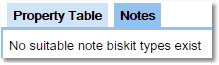
Once an approprite BiskitDef has been created the Notes tab will change from
 to
to 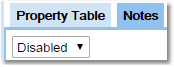 use the drop down to enable Notes.
Once enabled the user will see the following in the Notes tab.
|
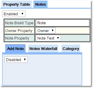
Note Biskit Type: This needs to be set to the Biskit Type that will hold the note information. |
Owner Property: This needs to be set to the property that points to the owning Biskit Type. This is the Biskit Type that the notes can be attached to in the Layout Editor. |
|
Note Property: This needs to be set to the property that will hold the note information. |
|
|
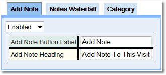
Add Note Button Label: This defines the string to be put on the button that will add the note to the database. |
Add Note Heading: This defines the string that will be used as a heading to the add note area. |
|
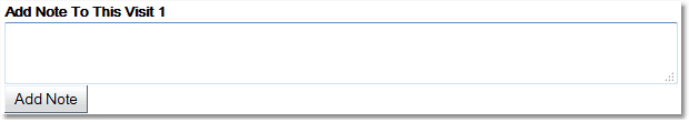
This information is used to determine how the add note area is defined. Below you can see an example of an add note area. |
|
|
|
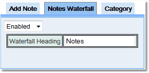
So far the area to write and add notes has been defined. Next the user needs to define an area to display all the notes that have been written to the DB, this is called a Notes Waterfall.
|
Once the Waterfall is enabled the user can define what heading will appear above the Waterfall in the layout. |
Finally notes can be stored under a number of Category's. In order to set up the Category's a hierarchical BiskitDef needs to be defined, this is where a parent can have many children of the same type of BiskitDef and a child will have only one parent. The minmum properties would be:
Property Type |
Description |
|---|---|
String |
This property will hold the Category name. |
Set |
This property will point to the children's BiskitDef as a Set. These will be of the same Biskit Type as the parent. |
Biskit |
This property will point to the parents BiskitDef. This will be of the same Biskit Type as the child. |
|
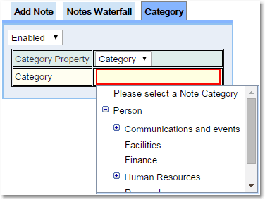
Once the Category is enabled the use will need to set the Category property. This is the property on the Note BiskitDef that points to the Category BiskitDef. |
Then the user will need to define which of the Category's the current Notes section will save Notes as. Any Waterfall enabled in this Notes section, will only display Notes of this Category. If no Category is enabled then the Waterfall section will display all Notes no matter what their Category. An Add Note can define a Category to create a Note under in one place in the Layout and a Notes Waterfall can be enabled with that Category defined somewhere else in the Layout if required. |
|
Permissions may be assigned to Category's to stop/allow viewing/editing of notes. A Permission assigned to a Category in a hierarchy will be inherited by all its children. |
The user can define their own CSS information for each Table, Row, Column or Cell using the CSS Editors. These editors are displayed as small icons with CSS written on them. In order to bring up the icons:
1.For a row, move the cursor to just to the left of the start of the row.
2.For a column, move the cursor to be just above the column.
3.For a table, move the cursor to be just outside the top left hand corner of the table.
4.For a cell, check the Show Cell CSS Editors box in the Property Group Toolbar.
When selecting a CSS Rule Editor the area to be affected will have a green border.

In the example above the first column has had the text colour set to Blue, the font-family set to Times New Roman and the font-size set to small.
When the CSS Rule Editor is opened up:

The possible CSS values are organised into different tabs to help with finding the required CSS value. When the drop down button is pressed for a value the user will have a choice of options. Some will require the user to input the appropriate CSS string (see Colour above). The user can also specify inherit which means the CSS will be inherited from previously defined CSS by the user, this could be in Global Preferences or elsewhere in Exprodo SDM where CSS can be defined.
For a complete description of the standard toolbar buttons read the Toolbar Button Standard Definition chapter.
CSS Editor Toolbar Item |
Description |
|---|---|
Remove All CSS |
Removes all CSS that the user has applied using the editor to this particular object. |
Show All CSS |
Shows in a pop up window the CSS that has been defined for this particular object. |
For more information and help on using CSS and HTML a site we recommend is http://www.w3schools.com/