Appearance
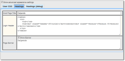
Appearance controls the look and feel of Exprodo SDM. It does this by allowing the creation of CSS to overwrite the default values. The user can also set the headings for the Host Page and for the Login page, as well as a banner to be displayed at the top of each page. The Headings (debug) setting will only be shown when the Show advanced appearance box is ticked.
Setting |
Description |
|---|---|
Allows the administrator to change the look and feel of the system for all users. |
|
To specify Cascading Style Sheets (CSS) that you would like to be used by Exprodo SDM. Anything specified here will override the default values, so that you can customise the look and feel. |
|
This sets several properties that control the look of Exprodo SDM, see the table below for the headers that can be changed. |
|
To specify the same sort of content as used for Headings above, but allows alternative values when Exprodo SDM is in debug mode. |
Skins
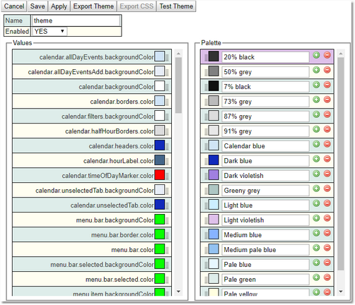
Administrators can choose the skins they want to us and can also define their own skin/theme. To create a new theme go to Search->Search and Search for: Theme.
Give the Theme a name, set the colours required for each of the elements and adjust the palette if required. Click Save and the theme will be available for selection in both the Global and User settings areas. Adjusting the pallette is a quick way to change the colour for all options that use it.
Export Themes: Will provide a download of the JSON that defines the theme.
Export CSS: Will provide a download of the CSS that defines the theme.
Test Theme: Works without saving and allows users to see changes straight away.
Value |
Effects |
|---|---|
calendar.allDayEvents.backgroundColor |
Area which is behind an individual All Day event booking, which is in the colour of its resource. |
calendar.allDayEventsAdd.backgroundColor |
Area where the All Day bookings are placed between the date and the resource name. |
calendar.backgroundColor |
All free space behind the whole Calender |
calendar.borders.color |
Area between resources, under dates and times, and other border areas, including background of selected calendar type (week, day, etc) |
calendar.filters.backgroundColor |
Background area for the filters on the left of the calendar. |
calendar.halfHourBorders.color |
The colour of the lines showing the half hour marks |
calendar.headers.color |
Colour of the dates text and selected calender type (week,day etc) text. |
calendar.hourLabel.color |
Colour of the Hour text |
calendar.timeOfDayMarker.color |
The marker for the current time of day. |
calendar.unselectedTab.backgroundColor |
Background colour for all unselected calender types (week,day etc). |
calendar.unselectedTab.color |
Text colour for all unselected calender types (week,day etc). |
menu.bar.backgroundColor |
Background colour for the complete menu bar |
menu.bar.border.color |
Border color of the menu bar |
menu.bar.color |
Colour of text on the menu bar |
menu.bar.selected.backgroundColor |
Colour of the currently selected menu option |
menu.item.selected.color |
Colour of the text of the currently selected menu option |
menu.item.backgroundColor |
Colour of items in the pulldown menu. |
menu.item.color |
Colour of the text of items in the pulldown menu |
menu.item.selected.backgroundColor |
Colour of selected items in the pulldown menu |
menu.item.selected.color |
Colour of the text of selected items in the pulldown menu |
splitter.color |
Colour of border between sections of editors (resource, layout etc.) |
tab.bar.backgroundColor |
Background colour of all unselected tabs used in Biskit Layout. |
tab.bar.color |
Text colour of all unselected tabs used in Biskit Layout. |
tab.bar.hover.backgroundColor |
Colour of tab background when hovering over it. |
tab.bar.hover.color |
Colour of tab text when hovering over it. |
tab.bar.selected.backgroundColor |
Background colour of selected tab. |
tab.bar.selected.color |
Colour of text of the selected tab. |
tab.border.color |
Colour of border around the tab. |
tab.panel.backgroundColor |
Colour of the background of the tabs panel. |
tab.panel.color |
Colour of text in the tabs panel. |
table.headers.border.color |
The colour of the borders around the table header. |
table.rowEven.backgroundColor |
Background colour of even rows. |
table.rowEven.color |
Text colour on even rows. |
table.rowHeader.backgroundColor |
Background colour for table header. |
table.rowHeader.color |
Text colour for table header. |
table.rowMouseOver.backgroundColor |
Background colour of row when mouse hovers over it. |
table.rowMouseOver.color |
Text colour of row when mouse hovers over it. |
table.rowOdd.backgroundColor |
Background colour of odd rows. |
table.rowOdd.color |
Text colour on odd rows. |
table.rowSelected.backgroundColor |
Background colour of selected row of table. |
table.rowSelected.color |
Text colour of selected row of table. |
tree.backgroundColor |
Bacground colour for all Tree areas such as Location, Resource. |
tree.hover.backgroundColor |
Background colour when hovering over a tree item. |
tree.hover.color |
Text colour when hovering over a tree item |
tree.selected.backgroundColor |
Background colour of a tree selected item. |
tree.selected.color |
Text colour of a tree selected item. |
tree.selectedHover.backgroundColor |
Background colour when hovering over a selected tree item. |
tree.selectedHover.color |
Text colour when hovering over a selected tree item. |
trigger.highlight.child.backgroundColor |
Background colour of the highlighted actions, child actions in a workflow. |
trigger.highlight.child.color |
Text colour of the highlighted actions, child actions in a workflow |
trigger.highlight.grandchild.backgroundColor |
Background colour of the highlighted actions, grandchild actions in a workflow. |
trigger.highlight.grandchild.color |
Text colour of the highlighted actions, grandchild actions in a workflow. |
trigger.highlight.parent.backgroundColor |
Background colour of the highlighted actions, parent action in a workflow. |
trigger.highlight.parent.color |
Text colour of the highlighted actions, parent action in a workflow. |
trigger.highlight.sibling.backgroundColor |
Background colour of the highlighted actions, sibling actions in a workflow. |
trigger.highlight.sibling.color |
Text colour of the highlighted actions, sibling actions in a workflow. |
trigger.highlight.siblingChild.backgroundColor |
Background colour of the highlighted actions, sibling child actions in a workflow. |
trigger.highlight.siblingChild.color |
Text colour of the highlighted actions, sibling child actions in a workflow. |
verticalTab.bar.backgroundColor |
Colour of the vertical tab area. |
verticalTab.bar.color |
Colour of the text in a vertical tab. |
verticalTab.bar.hover.backgroundColor |
Background colour when hovering over a vertical tab item. |
verticalTab.bar.hover.color |
Text colour when hovering over a vertical tab item. |
verticalTab.bar.selected.backgroundColor |
Background colour of a vertical tab selected item. |
verticalTab.bar.selected.color |
Text colour of a vertical tab selected item. |
verticalTab.bar.selectedHover.backgroundColor |
Background colour when hovering over a selected vertical tab item. |
verticalTab.bar.selectedHover.color |
Text colour when hovering over a selected vertical tab item. |
verticalTab.panel.backgroundColor |
Colour of the vertical tab panel. |
verticalTab.panel.color |
Colour of text in the vertical tab panel. |
User CSS
An example of User CSS, would be the following
#registerButton
{
display: none;
}
This would remove the Register New User button from the login page.
Headings
Heading options |
Description |
|---|---|
This changes the HTML title of the page used for Exprodo SDM so that it will show in the web browser. |
|
This lets the user provide alternative HTML for the header that appears on the login page. |
|
If a page banner is required, this is the HTML that will be shown at the top of every page. |


