Menu Editor

Contents
Using the Menu Editor page the administrator can create, modify and delete the menus that exist in Exprodo SDM. Once menus are created, a menu can be assigned to a user either by relying on the global preferences for new users (see the Menus tab of Global Preferences) or by manually selecting the menu for particular users (see Changing A User's Settings), allowing menus to be set up by the users role or on a user by user basis. There are many different types of pages that can be added to a users menu. They include but are not limited to:
1.Customised search or data explorer pages
2.Customised calendar pages using bookmarks
3.Pages that open up web pages external to Exprodo SDM
4.Running predefined reports
5.Pages normally found only on the Admin menu
6.Customised Biskit editor pages
7.Trigger a User Workflow Event
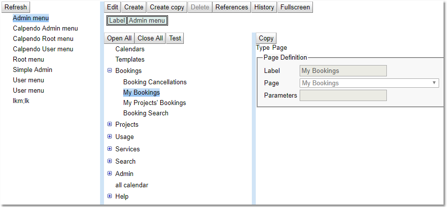
The Menu Editor page consists of three parts:
1.The left pane: This shows the available menus, and which menu is currently being edited. It has a single available Button on its menu toolbar to Refresh the contents of the pane.
2.The middle pane: this shows the content of the currently selected menu.
3.The right pane: this shows the detail of the currently selected menu item
The Menu Toolbar (Middle Pane)
The tool bar at the top of the page of the middle pane contains buttons that operate on whole menus at a time.
There is also a toolbar for dealing with the individual menu.
For a complete description of the standard toolbar buttons read the Toolbar Button Standard Definition chapter.
Tool Bar Item |
Description |
|---|---|
Test |
Loads the currently selected menu into the menu bar to test. |
The Menu Item Toolbar (Right pane in edit mode)
The tool bar in the right pane contains buttons that operate on single menu items.
For a complete description of the standard toolbar buttons read the Toolbar Button Standard Definition chapter.
Tool Bar Item |
Description |
|---|---|
Up |
Moves the currently selected menu item up |
Down |
Moves the currently selected menu item down |
New item |
Creates a new menu item at the same level as the currently selected menu item. |
New sub-item |
Creates a new menu item as a child of the currently selected menu item. |
The Middle Pane
|
This shows a tree with the contents of the currently selected menu. If an item is selected, then:
•that menu item is loaded into the right pane so you can modify the item •use the Menu Item Toolbar to operate on the selected menu item
|
The Right Pane
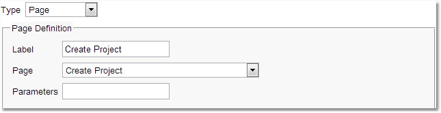
This shows the details of the currently selected menu item. The first property shown is the menu item's type. There are five types, as described in this table:
Type |
Description |
|
|---|---|---|
Page |
This type of menu item is one that shows a page. When menu item is set to Page, the following properties need to be set: |
|
Property |
Description |
|
Label |
This is the text that should be displayed on the menu. |
|
Page |
This is a drop-down that allowing selection from all the different types of pages that Exprodo SDM supports. |
|
Parameters |
Some pages support additional parameters. If a page is selected that supports additional parameters, then the parameters value will be filled with a template that shows the sort of content expected. |
|
Menu |
This type of menu item is one that contains only sub-menu items. When this type is selected, also select the label that should be displayed for the sub-menu. |
|
Separator |
Creates a horizontal line in the menu that separates the items before and after it. Once selected, also fill in the label. The label is not shown on the menu itself, but is used to display the item in the menu editor's left pane. |
|
Window |
This represents a menu item that, when selected, will open another browser window. Set the following properties: |
|
Property |
Description |
|
Label |
This is the text that should be displayed on the menu. |
|
URL |
This is the address of the web page that should be loaded into the newly created browser window. |
|
Type |
Description |
|
|---|---|---|
Custom Page |
This type of menu item is one that shows a custom built page. After choosing Custom Page, then set the following properties: |
|
Property |
Description |
|
Label |
This is the text that should be displayed on the menu. |
|
Token |
What the configurer wishes to appear in the browsers top address bar when this menu item is selected for example in the case of the Menu Editor: #menuEditor |
|
Custom Page Type |
The type of custom page to create, 1.Biskit Tree Editor 2.Biskit Tree Viewer 3.Bookmark Page 4.Calendar By Location 5.Create Biskit Page 6.Customised Search Page 7.Data Explorer Page 8.Frame Page 9.Run Predefined Report 10.Run User Workflow Event |
|
Additional Information |
This depends on the custom page type chosen |
|
More information on the different types of Custom Pages.
Page |
Description |
Additional Information |
|---|---|---|
Biskit Tree Editor |
A page which which will display and edit a user-defined selection of Biskit Types. For example, if new Biskit Types have been created such as Doctor and Nurse and both a Doctor and a Nurse are associated with bookings, then create a menu item that takes the user to a page where they can create the Doctors and Nurses. |
A list of the Biskit Types to be displayed on the page. Once created the order can be adjusted. |
Biskit Tree Viewer Page |
Provides a way to display a number of HTML pages with a navigation panel for users to choose which page to view. |
1) The Biskit Type to be displayed 2) The property with the information to be viewed. |
Bookmark Page |
A Calendar page with the specified bookmark set up |
The bookmark to be used. |
Calendar By Location |
Creates a cascading menu based on the defined locations, showing all resources at each location. |
The Base Location, from which to cascade. The Label of the option that will take the user back to the calendar without changing the resources. Null means its not required. |
Create Biskit Page |
A page that creates a particular type of Biskit. |
The Biskit Type to create Biskits of. |
Customised Search Page |
A search page customised to your specific requirements |
1) The Biskit Type to be searched for 2) The report type to be used 3) A descriptor to define additional search buttons available on the search page. See below for a definition of the descriptors allowed. 4) Any Conditions to be used in the search |
Data Explorer Page |
A customised Data Explorer page |
1) The Biskit Type to be displayed 2) The ID of the particular record to be displayed. 0 or empty means display all 3) Whether a user viewing the custom page may change the Biskit Type being displayed. |
Frame Page |
Opens any URL as a frame inside Exprodo SDM. This will display with the menu at the top of the page and then the content of the URL specified below. |
The URL to be displayed. For example: url=http://www.exprodo.com |
Run Predefined Report |
Runs a report either system or personal. |
The report to be run |
Allows then user to run a Workflow from the menu. |
1) waitForEvent: whether the system will wait for the workflow event to finish or continue straight away, defaults to True. 2)holdingMessage: message to show whilst waiting for the event. |
The following page type may be useful when customising menus:
Page |
Description |
Parameters Example |
|---|---|---|
Opens up an editor which allows the user to define how to layout properties in a Biskit so that they can be read and managed easily. This is useful if your type has a large number of properties to be displayed. |
||
Find by URL |
Opens up a page based on a URL |
searchtype= |
Create a custom biskit and give it a Name property and a Content property. The Content property should be of type String, and of subtype HTML.
Create a number of instances of the new Biskit Type, giving each a name and adding content in rich text associated with the name. This can include links and images.
Use the Menu Editor to add a custom page of type Biskit Tree Viewer, and specify the type of biskit and which property contains the HTML content to display.
Users then see the names of the biskits appear in a navigation pane on the left with the associated content on the right.

Descriptors for Custom Search Pages
The definition of the format of a descriptor:
•line := {group}[;{group}]*
•{group} := [{initialFlags}[:[css-class][:label]]]{item}[,{item}]*
•{initialFlags} := (H|V|G|F|E|C)[S|L][A][T|O]
•{item} := {propPath}[:{itemFlags}][*][!]
•{itemFlags} := (S|L)
•{propPath} = a path, this may be the name of a property e.g. "status", or a path to the property e.g. "project.status", or [Free] in which case all String properties are searched for the value.
Where:
•css-class is the CSS class to be applied to the top level
•the initial flags are:
oflags to indicate the overall behaviour of the search:
▪H = horizontal button bar
▪V = vertical panel
▪F = Form-like container that displays each item with a heading in the line above the search item.
▪G = Growing form - displays like a form but can be hidden or shown by ticking a checkbox.
▪E = Expanding, a container showing a checkbox for each item, where clicking the checkbox will open up the search item
▪C = Captions around each of the items in the container
▪F = Form, labels above each widget
oflags to indicate the default size of items. Note that these can be overridden by size flags placed on each item:
▪S = Small - widgets in this container should be small size by default
▪L = Large - widgets in this container should be full size by default
oSorting flags:
▪No flag means items are presented in the order specified and (when using the A flag, their natural order)
▪T = sort all items in this container by their text label
▪O = sort all items in this container by their bakery-assigned order
oMiscellaneous flags:
▪A = automatically add items for all known properties not added elsewhere
•item flags define the size:
oS = small - minimal widgets in a row
oL = large - widgets taking full size the whole time
Examples:
•status:*;service.provider:*;service.location:*;{EAT}
•{CL:myCSSclass:My Label}status:*,service.provider:*;{F}service.location:*
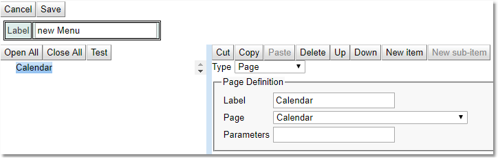
Press Create on the menu toolbar, and type the name of the new menu into Label box.
Using the Menu Item Toolbar, press New Item, then in the right pane set up the Type to be Page, and for the Page Definition set Label to Calendar and Page to Calendar. This will create the first menu item.
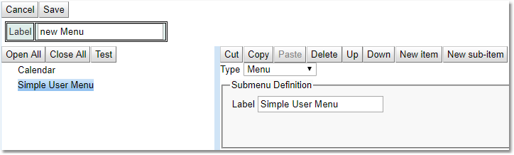
Using the Menu Item Toolbar, press on New Item, then in the right pane set up the Type to be Menu, and for the Submenu Definition set Label to Simple User Menu. This creates a simple sub menu.
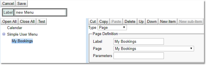
Using the Menu Item Toolbar, press New Sub Item, then in the right pane set up the Type to be Page, and for the Page Definition set Label to My Bookings and Page to My Bookings. This will put an item on the Simple User Menu sub menu.
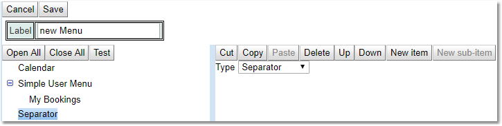
Click on Simple User Menu then using the Menu Item Toolbar, press New Item, then in the right pane set up the Type to be Separator. This creates a simple separator to which is a line across the menu to split the menu into sections.
Continue adding in pages, custom pages, sub menus and separators until the menu is created. Once finished use the Save button and then use the Test button to install the menu temporarily into the browser. Check the menu to make sure it is what is required. Remember to use the Up, Down buttons to change the order of items in the menu. Look at the chapter on Changing a Users Settings to see how to apply this menu to a particular user. Remember putting this menu as an option in Global Preferences will only change that menu for new users not existing users.